Goal
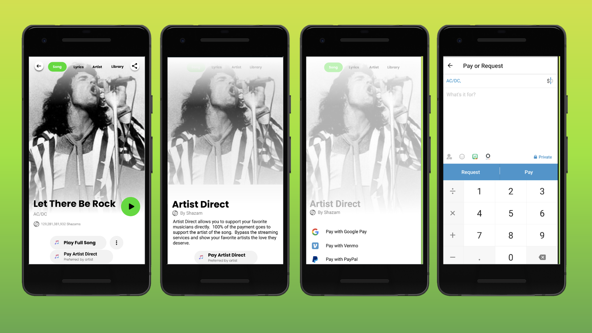
For this exercise, some colleagues collaborated with me to audit a few mobile apps and ideate on what the Shazam app, which "listens" to and identifies songs, would look like if Lime scooter app's design system were applied to it, and how Venmo payment platform could be incorporated into a user flow.
Lime Design System Audit
First we audited Lime's design system to see what aesthetic should be applied to our revamped application.


Ideation and Prototype Flows
This embed contains some of our sprints and prototype user flows in Figma.
Reflection
What products or resources did you look to for patterning inspiration?
CJ: We mostly looked at the existing three products we were given, Venmo, Lime, and Shazam. Since we had to kind of adjust our assignment because Shazam does not necessarily have a need for pricing at its base form, we kind of just came up with this concept of artist direct which to my knowledge didn't have any single source of inspiration.
Clint: Venmo, Shazam, and Lime were our main design inspirations. We tried to stay true to Lime’s design system, finding elegant ways to incorporate it into Shazam. Since Lime skews more simplistic than Shazam’s intricate, layered menus, we had to remove a lot of design noise from the layouts.
Trent: We also looked at the differences between Android and iOS, and their dark and light UIs. In Shazam’s light UI, there they lean heavier into their branding blue tones, while they use blacks and greys for their dark UI. Using Lime’s system, we leaned hard into their light UI with a focus on Lime’s green tones.
Google Assistant’s music ID and PayPal. We looked at Google’s assistant music ID because it also listens to songs/music and identifies it. We looked at the flow and how they would go about purchasing that song/album and music service. They all have their respective paying option but wasn’t through a third-party service. PayPal is similar to Venmo, but is a bit more tedious. However, it felt more secure because you saw security visuals (icons) to indicate this ideal.
What questions might you ask your product team(s) before diving into design?
CJ: How does this product change between Android and IOS, how does the design system change, is there a perceived need for this need of incorporating Venmo into the app or are we just doing it without any reason? What is our end goal to increase profit or gain more users or something else?
Clint: There were a lot! We really wracked our brains developing scenarios in which Venmo could be incorporated into the Shazam flow to make purchase. Most of our big questions revolved around what the purpose would be; what is the over-arching goal? This would be the biggest thing to ask the product team, to develop a thorough conceptualization of what is to be accomplished and how it should work. This would help a lot in tracking toward a solid design.
Trent: What are the elements across Android, iOS, Desktop and Mobile. How are they different or the same? What problems are we looking to solve? Does our current design system solve the problem, or do we need to create a new component to solve it? Have we A/B tested it? What came of the usability tests? What opinions do the product, development, and other stakeholders say?
What's next after creating these mock-ups?
CJ: We would most likely move on to user testing the prototypes that we made, this would help give feedback as well as give more information on which direction to push the design or confirm the work we have already done.
Clint: Besides the testing and rework of this particular flow, there is another possibility we explored where musicians would be able to procure a license to sample existing works through shazam and incorporate snippets of songs (legally) into their own works. There are some fairly complex screens that need to be resolved in order to incorporate Lime’s design system into them. More time spent brainstorming alternative flows, exception handling could not hurt.
Trent: I would like to have three versions to do a static A/B/C test. That gives the user more to think about when answering questions about the UI. Then I would ask them what elements from each they would use to create their ideal solution. This gets them thinking and gives the design team direction on how they think (their conceptual model). Like CJ said, continue to test the solution. Do internal and external tests.
Are there any aspects of this flow you'd like to test? (if yes, what aspects? If no, why not?)
CJ: One area of this flow I would like to test is how users respond to the artist direct feature, right now we designed it in such a way that when you click on the artist direct button it gives you a little more information. But what I would like to test is if the artist direct button is too inconspicuous, or if users get tired of seeing the information screen about artist direct.
Clint: Would be interested in testing this flow to see if participants would understand the goal (to pay the artist directly) without prompting. Lime’s design system prioritizes simplicity and trades wordy explanations for iconography. Shazam, and the business of purchasing, and explaining new concepts that may not be familiar to users, would be difficult to navigate with only a few words. Would be an interesting puzzle to noodle on.
Trent: Nope. It’s perfect. Yes, of course. I want to ensure the Artist Direct option is clear. Our goal is to help artists directly. By allowing them to add a Venmo account to their profile, listeners can pay them directly instead of the streaming service or record label.
How was (or wasn't) the design system helpful in building out this flow?
CJ: I think it was helpful building out this flow because it helped me to really understand how powerful a design system is when it was in place. It made creating new features a-lot easier as you could almost just plug and play elements that you needed into each new piece. As a UX designer I find it very useful in creating prototypes because I don’t need to focus on creating a beautiful ne design but can focus more on how the user moves through using these pre-established tools.
Clint: Lime is sort of an la carte design. It does not jive perfectly with Shazam. Placement of items, colors, and contrasts are not optimal for Shazam's layouts. A great design system might skew more toward universal applicability. Maybe that is a litmus test of a design system: can be applied to any/many app(s) and work?
Trent: It had the basic design elements, but their system doesn’t mesh well with Shazam. Each system solves their product’s problem once you get into organism, template, and page components. Other systems are the same way, and we should think about other design systems and how they solve problems instead of using their solution for our own. In other words, one size does not fit all.